目次
1. HTMLを書く(index.html)
3人分を横並びにできる構造にしています。まずはそのまま貼り付けてください。(前回のものに上書きでOKです)
<!DOCTYPE html>
<html lang="ja">
<head>
  <meta charset="UTF-8" />
  <meta name="viewport" content="width=device-width, initial-scale=1.0" />
  <title>プロフィールカード</title>
  <link rel="stylesheet" href="style.css" />
</head>
<body>
  <main class="wrapper">
    <section class="profile-list">

      <div class="profile-card">
        <p class="job">カフェスタッフ</p>
        <h1 class="name">みさき</h1>
        <p class="bio">
          都内のカフェで働きながら、
          接客スキルと写真撮影を勉強中。
        </p>
        <a href="#" class="button">詳しく見る</a>
      </div>

      <div class="profile-card">
        <p class="job">Webデザイナー</p>
        <h1 class="name">ゆうた</h1>
        <p class="bio">
          バナーやLP制作を中心に活動。
          シンプルなデザインが得意。
        </p>
        <a href="#" class="button">詳しく見る</a>
      </div>

      <div class="profile-card">
        <p class="job">動画編集者</p>
        <h1 class="name">さくら</h1>
        <p class="bio">
          YouTubeやショート動画の編集を担当。
          分かりやすさを大切にしています。
        </p>
        <a href="#" class="button">詳しく見る</a>
      </div>

    </section>
  </main>
</body>
</html>
ここでは
section.profile-list が「カード全体の並び」
div.profile-card が「1人分のカード」
という役割になっています。
2. CSSを書く(style.css)
3人分を横に並べつつ、画面が狭いときは縦に並ぶようにしています。(前回のものに上書きでOKです)
* {
  box-sizing: border-box;
}

body {
  margin: 0;
  font-family: system-ui, -apple-system, "Segoe UI", sans-serif;
  background: #f3f4f6;
  color: #111827;
}

.wrapper {
  min-height: 100vh;
  display: flex;
  align-items: center;
  justify-content: center;
  padding: 20px;
}

.profile-list {
  display: grid;
  grid-template-columns: repeat(auto-fit, minmax(280px, 1fr));
  gap: 20px;
  max-width: 900px;
  width: 100%;
}

.profile-card {
  background: #ffffff;
  padding: 24px;
  border-radius: 16px;
  box-shadow: 0 10px 25px rgba(0, 0, 0, 0.1);
  text-align: center;
}

.job {
  margin: 0;
  font-size: 14px;
  color: #2563eb;
  font-weight: 600;
}

.name {
  margin: 8px 0;
  font-size: 22px;
}

.bio {
  font-size: 14px;
  line-height: 1.6;
  color: #4b5563;
  margin-bottom: 20px;
}

.button {
  display: inline-block;
  padding: 10px 18px;
  border-radius: 999px;
  background: #2563eb;
  color: #ffffff;
  text-decoration: none;
  font-weight: 600;
}

.button:hover {
  opacity: 0.9;
}
3. ブラウザで確認する
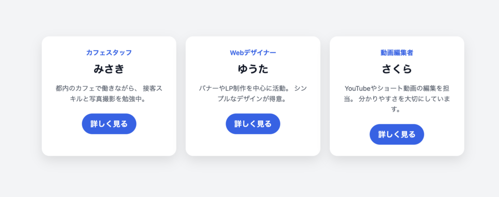
index.html を開くと、カードが3枚並んで表示されます。画面幅を狭くすると、自動で縦並びに変わります。
4. この構成で学べるポイント
・同じHTML構造をコピーするとカードを増やせる
・CSSのgridで「並び」を制御している
・カード1枚のデザインは共通で使い回せる
実際のWebサービスでよく使われる構造です。
5. すぐできる練習改造
・名前や職業を自由に変えてみる
・カードを4人分に増やす
・buttonの色を人ごとに変える
・bioの文章量を増やして高さの違いを見る
など、好きなように変更して練習してみてください。